Customization
Customize the scoutbar experience
Scoutbar has created a seamless use of general classes to override scoutbar theme, currently you can customize the experience for the following.
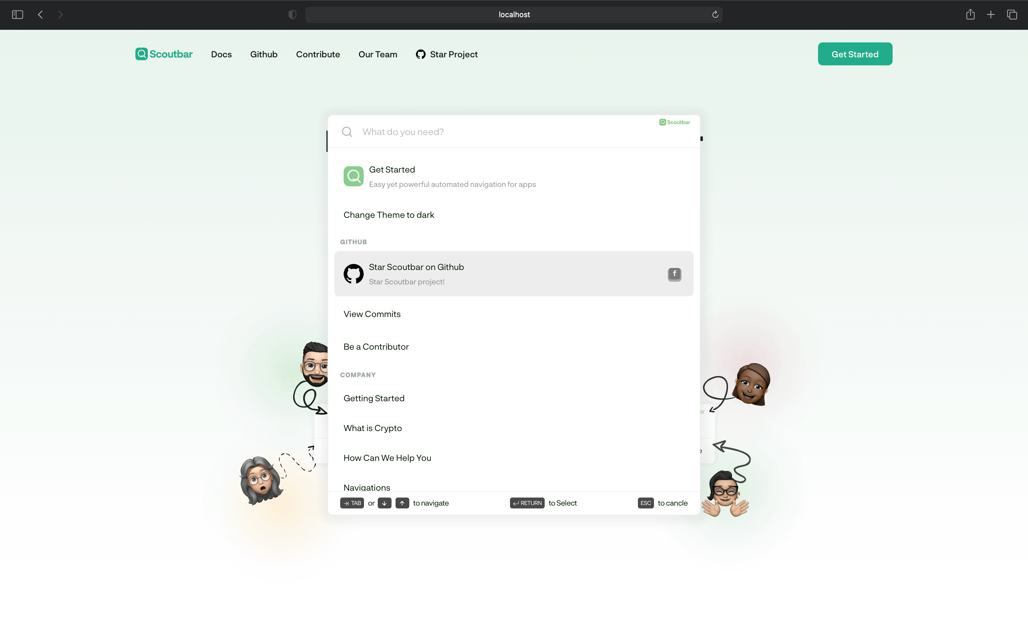
Snackbar
The snackbar is a shortcut to engage use to use the scoubar it self. it only
activates when the user clicks the CMD or K keys.
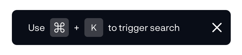
creates and experience to alert the user that there is a navigation magician in the house.
  /**
   * Set snackbar color and position
   */
  snackBar?: {
    background: string;
    color: string;
    position: 'top' | 'bottom';
    style: React.CSSProperties;
  };
Animation
Allows you to disable every animation on scoutbar Disables every animations on
scoutbar. this is by default true if scoutbar detects that the user has
requested that the system minimize the amount of non-essential motion it uses.
/**
 * Disable animations on the scout bar.
 * @default false
 */
noAnimation: boolean;
Placeholder
You can customize the placeholder for the scoutbar to accept set of arrays or just one string
  /**
   * Scoutbar placeholders
   */
  placeholder: string[] | string;
Example
<ScoutBar placeholder="How can we help you at Apple LLC" />
or
<ScoutBar
  placeholder={[
    'Buy drugs now at Apple',
    'Search for your recurring medicines',
  ]}
/>
Theme
Right now we have Light, Dark and Auto theme. when in auto scoutbar
defaults to the users system theme.
/**
 * Theme to use for the scout bar.
 * @default 'light'
 */
theme: 'light' | 'dark' | 'auto';
Scoutbar brand color
Hook the scoutbar theme i.e Active states, hover states,focus states of the entire scoutbar to one color.
/**
 * Change scoutbar brand color.
 * @default '#000'
 */
brandColor: string;
Scoutbar Position
Make the scoutbar center of the window screen or start from the top
/**
 * Center the scoutbar
 * @default false
 */
centered: boolean;
Advanced
Overriding Scoutbar CSS
Scoutbar uses css modules on the hood but also provides some BEM classes for
developer to override the UI or theme.
PS:
This is only to be used on rare cases and might affect how the UI is
rendered. We have provided a list of open variables to be customized
  /* Controls the white colors */
  --scout-white: #fff;
  /* Controls the text color */
  --scout-theme-black: #021a03;
  /* Controls the scoutbar brand this is easily overridden by the `brandColor` props */
  --scout-theme-green: #61bb65;
  /* Mostly controls the borders */
  --scout-light-grey: #ebebeb;
  /* Controls the Placeholder, and the default state for the scrollbar */
  --scout-theme-grey: #bdbcbc;
  /* Controls the card hovers */
  --scout-theme-card-hover: #ededed;
  /* Controls the keyboard `span` on the tutorial section */
  --scout-theme-keyboard: 0px 2px 0px 2px #8d8d8d;
  --scout-tutorial-grey: #494949
    /* Controls the scoutbar box-shadow */
  --scout-box-shadow: 1px 2px 16px 10px rgba(0, 0, 0, 0.05);
Usage
 .scout__bar-wrapper{
  --scout-white: #fff;
  --scout-theme-black: #021a03;
  --scout-theme-green: #61bb65;
  --scout-light-grey: #ebebeb;
  --scout-theme-grey: #bdbcbc;
  --scout-theme-card-hover: #ededed;
  --scout-theme-keyboard: 0px 2px 0px 2px #8d8d8d;
  --scout-tutorial-grey: #494949
  --scout-box-shadow: 1px 2px 16px 10px rgba(0, 0, 0, 0.05);
  }
Other customizable classes
scout__bar-container
This powers the entire box rendered on the scoutbar screen. recommended override styles
{
  position
  transform
  z-index
}
scout__bar-wrapper
This powers the actions, sections, and pages wrapper. recommended override styles
{
  animation
  border
  border-radius
  box-shadow
  padding
}
scout__bar-wrapper-input
This powers the input module. recommended component style override
<svg></svg> <label></label>
scout__bar-tutorial-section
This powers the entire tutorial section. recommended component style override
{
  padding
}
They are all other BEM classes hooked withing the DOM structure but these are the advisable ones to hack around. but then who am i to tell you what to do ? hack away.